HealthState

OVERVIEW
HealthState believes that a company’s success starts from within. Therefore, they want to create a platform for employers to really look into their employees’ health state and how it can affect the employees’ performance, hence making adjustments and employees health and wellness decisions through a dashboard of aggregate and actionable data
ROLE
UI/UX Designer
User Research, User Personas, Journey mapping, UI/UX Design, Prototype
SOFTWARES
Adobe Xd
From C to B

HealthState operates as a B2B layer on top of a B2C product. Here's how the ecosystem works:
Employers contract with HealthState to offer a health and wellness program to their workforce. Employees who opt in receive HealthConfirm at-home test kits tailored to the employer's program. Once tests are completed, HealthState aggregates the anonymized results and surfaces them in the employer-facing dashboard. Employees can monitor their own data through the HealthConfirm interface; employers see only aggregate trends — never individual results.
Understanding this ecosystem was essential before designing anything. The data flowing into the dashboard wasn't just numbers — it was health information with ethical weight. Every design decision had to account for what employers legitimately needed to see, and what they should never be able to infer.
It’s not easy being first

HealthState was one of the first platforms to build a corporate wellness program around hormone testing. That meant we weren't designing against a familiar pattern — there was no established mental model for what this dashboard should look or feel like, either for us or for our users.
We ran a design sprint grounded in data from HealthConfirm user feedback, tradeshow surveys, and executive briefings to identify our target users, define the MVP scope, and determine what data employers actually needed at launch. Rather than design for an imagined user, we built from evidence.


Our primary users — HR leaders, Benefits Administrators, and executives — are not clinicians. They don't interpret hormone charts by training. Designing for them meant translating clinical precision into business relevance: not "cortisol is elevated" but "a significant portion of your workforce is showing stress patterns that typically affect productivity."
Build from the ground up


We had no legacy system to work from, which was both a constraint and an opportunity. I functioned as the lead UI/UX designer while also consulting on broader design decisions across branding, onboarding, and the sales proposal process.
My core focus areas were:
Data visualization — presenting biomarker data accurately at both high and granular levels of detail, for users without clinical backgrounds.
Navigation architecture — designing a main nav and dynamic sub-navigation system that let employers quickly orient themselves and filter toward the information most relevant to their program.
The full employer portal — from the dashboard itself through to the landing page for prospective clients not yet using the platform.
Lines, charts, graphs, action!
Data visualization was the most technically demanding design challenge on this project. Hormone data isn't like sales figures — it has clinical reference ranges, time-of-day dependencies, and population distribution characteristics that all affect how it should be displayed. Choosing the wrong chart type wouldn't just be aesthetically wrong. It could be misleading.

I mapped each data type to its visualization deliberately:
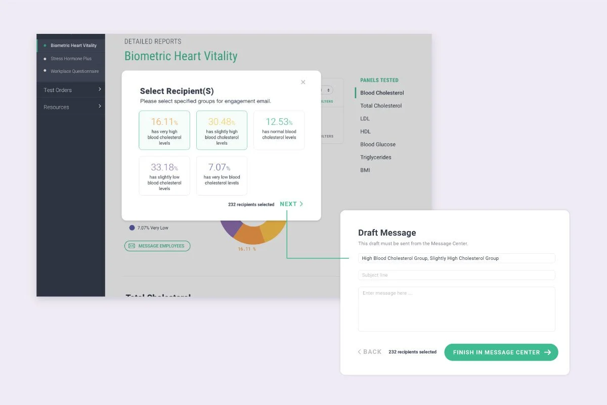
Hormone levels and aggregate distribution use donut charts — the proportional breakdown of employees across ranges is the primary insight, and the donut format communicates share-of-whole immediately.
Cortisol levels use line graphs — because cortisol is a time-series measurement. The story is rise and fall across morning, noon, evening, and night, and a line graph preserves that narrative in a way a bar chart cannot.
Health surveys use bar charts — for direct comparison across response categories, where relative magnitude matters more than proportion.
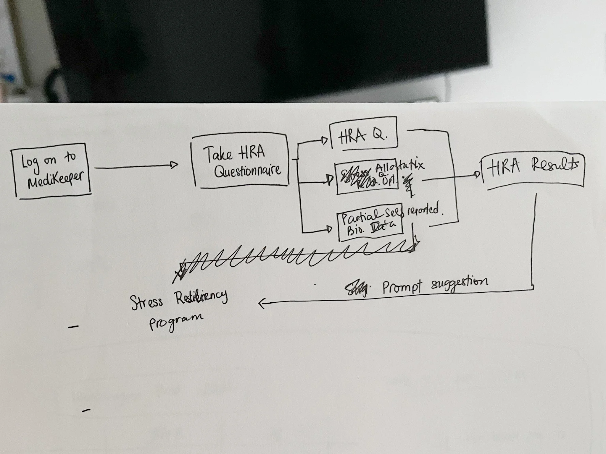
Health Risk Assessment results use pie charts — to show how the employee population distributes across defined risk categories from the MediKeeper partnership.
For the cortisol dashboard specifically, I designed the line graph to display clinical reference ranges (high in red, normal in green, low in orange) alongside plotted aggregate data points that employers can click into for drill-down detail. The interaction was intentional: the line gives you the population-level pattern; the click gives you the segment breakdown. Employers get both the signal and the context without being overwhelmed by a single dense view.

Upon receiving the data of the percentage of employees that are in the normal / abnormal range, employers have the option to message their employees to check in / send out actionable information / offer solutions depending on how their process is like internally.

For employees’ health surveys, HealthState will conduct and send out surveys to employees through the portal, and from there employees who chose to answer will contribute to the aggregate data. The questionnaire for this survey is pre-determined and will be further customized with the employers’ needs.
Partnering with MediKeeper for our Health Risk Assessment section, depending on the employees’ health survey, certain questions will fall into a predetermined section that will help identify certain health risks like disease risk, stress and depression risk, smoking, etc.. This will be shown through a pie chart.
Non-Invasive
Privacy wasn't a compliance checkbox on this project — it was a core design principle that shaped every interface decision.
Employers can see that a percentage of their workforce has elevated stress markers. They cannot see who. When they choose to act on that data — sending a wellness resource, initiating a check-in — the message routes through HealthState before reaching employees. The employer never has direct contact that could compromise anonymity.
Designing this flow required thinking carefully about what to surface and what to withhold at every step. Aggregate charts had to be granular enough to be useful but not so granular that small team sizes could expose individuals. Message flows had to feel actionable without creating a dynamic where employees felt surveilled.
The privacy architecture wasn't invisible to users — it was communicated as a feature. Trust in the platform depended on employers and employees both understanding how the data was handled.
Clear view ahead

A data-heavy dashboard is only useful if users always know what they're looking at and can navigate to what they need without friction. I designed a two-level navigation system to support this.
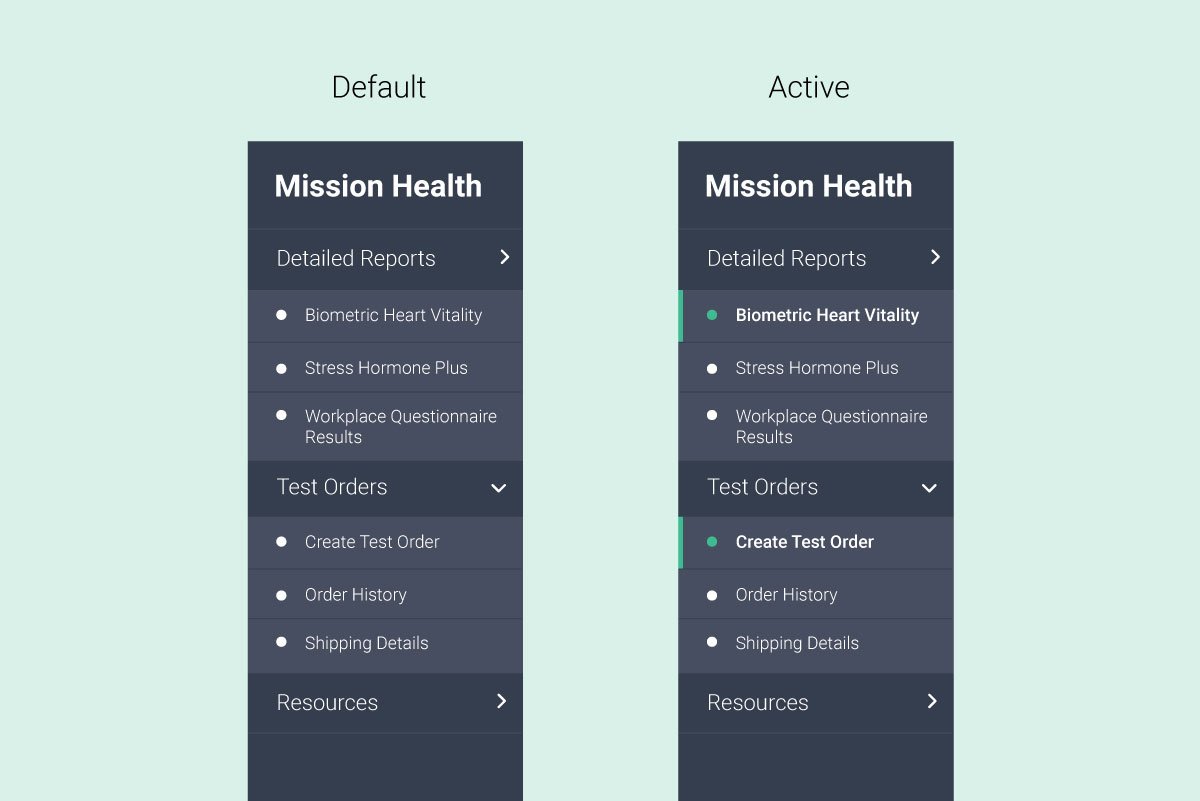
The main navigation organizes the platform into three clear domains: Detailed Reports (the test data dashboard), Test Orders (history and new orders), and Resources (wellness content, onboarding documents, challenge materials). Upon signing in, users land directly in the Detailed Reports section relevant to their active program — no intermediary step.

The sub-navigation is dynamic. Rather than a static secondary menu, it adapts its content to whichever section of the dashboard the user is in. In the Detailed Reports section, it acts as a panel navigator — guiding users through each biomarker tested. In the Test Orders section, it transforms into a live order review sidebar, updating in real time as employers select test types and employee counts.
This adaptive approach kept the interface lean while serving genuinely different navigation needs across sections. Users don't encounter navigation they don't need.

Filter, filter, filter!
Employers needed the ability to drill into their data — by department, time period, test type, or demographic cut — without losing their place or forgetting what filters they'd applied.

I designed a five-filter system with persistent filter state visibility. Once filters are applied, the active selections remain visible as color-coded pill tags that match their parent filter category. Users can see at a glance what lens they're looking through, and remove individual filters without resetting everything.
The design principle here was: the user should never have to reconstruct their context. Whatever view they've built, the interface should hold it for them.
WHAT I LEARNED

Designing for health data in an enterprise context taught me that the hardest UX problems aren't visual — they're ethical and architectural. Before I could design a single chart, I had to understand what employers were entitled to see, what employees needed to feel safe, and how to build an interface that honored both.
It also sharpened how I think about data visualization as a communication discipline, not just a design task. Chart type selection, range labeling, interaction depth — these are all decisions that affect whether a user draws the right conclusion or the wrong one. In a health context, that distinction matters.
Working on a zero-to-one product in a new category also reinforced how much value there is in a strong design sprint early. When there's no existing pattern to follow, the research foundation you build at the start determines the quality of every decision that follows.