MyHealthConfirm.com

OVERVIEW
MyHealthConfirm.com needs their own e-commerce site so that they can offer detailed insights and educational information on their products. In order to set themselves apart from competitors, HealthConfirm offers actionable follow-up lab comments as well as easy to read and understandable results for their hormone and health and wellness lab tests.
PROJECT GOALs
Launch HealthConfirm as its own brand with own e-commerce site showcasing the entire line of 12 different hormone and health and wellness products and counting
Make sure customers can find the test they want/need accordingly to their demands the easiest way possible
Establish HealthConfirm stand in the health & wellness world: setting themself apart with great user experience - easy to understand and actionable results that customers can act on
WHAT I DID
Complete design of E-commerce site & Amazon storefront with mobile first mindset and extended branding
Conduct sprints, gave feedback and work closely with Design Manager to complete updated Branding and Brand Guidelines
Identify, consolidate and create 6 different templates from 7 different page types for the whole site
ROLE
UX/UI Designer
User Research, UI/UX Design, Branding, Illustration, Prototype & Testing
SOFTWARES
Adobe Xd, Lucid Chart, Shopify, Contentful
THE PROCESS

Research
Define personas, content strategy, gathering data from previous site about what works and what doesn’t.
REBRAND
Redefine our goal and tone from existing branding, then build out graphic elements to aid in site’s design
REBUILD
Wire-framing, prototyping and rebuilding the new site from data collected & updated graphics
Putting Customers First
HealthConfirm is underrepresented as a product and lifestyle of its own brand by being sold as part of other e-commerce site. The limited design on these pages are not user-friendly for MyHealthConfirm.com personas.
PROBLEM
With 12+ products and counting, HealthConfirm needs to shape habits for its market. These are the products that people need but may not know they need it yet, and we need to make that process easier for customers.
SOLUTION
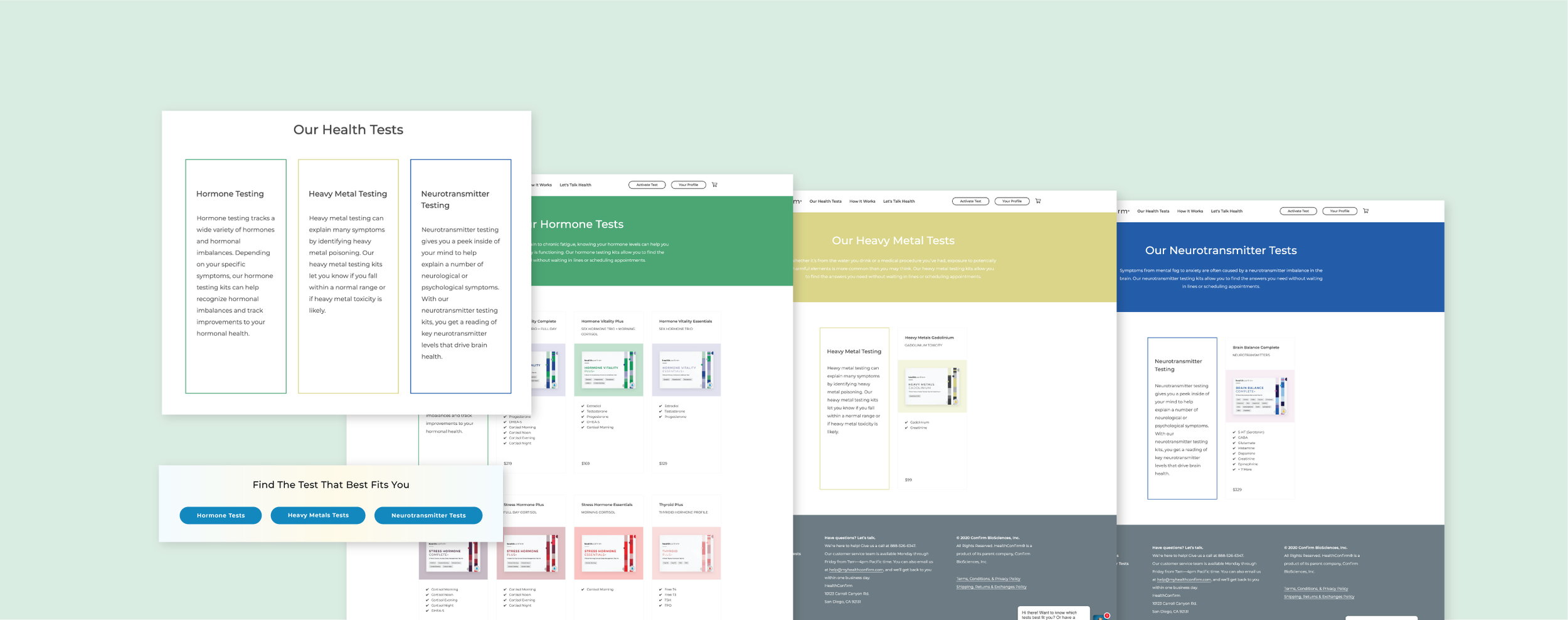
Putting HealthConfirm in categories that users know of and understand with easy to understand explanations. We split the tests into 3 categories, each have its own niche market.
As HealthConfirm products are very new and has a very specific market, it is important we present ourselves as someone who is here with the customers every step of their journey to better health and wellness. Hence, we need to educate users in a way that will make them want to learn more about the products as well as easy to understand for them

What are customers getting themselves into?
It’s important you know what to expect when you are introducing something new into your life. Seeing the lack of presenting that info on the current market, we make sure to address just that both in packaging and digital:
What is this test consist of? ( Packaging, kit content, and sample results)
What they are testing for ( Test panels and configurations)
How invasive it is (collection method)
All these informations stay above the fold or right underneath the fold, at top of the product page, so customers can have an idea of what they’re getting in the mail as well as how it works right away. Further down the page, customers will be able to learn in details what each panels are and how it affects their bodies. We also uses icons to represent symptoms, which can be more relatable to customers’ personal experience rather than medical terms.
The New Health Test In Town

HealthConfirm Home Page Above the Fold with Categories clearly present

Category Page with clear explanation and all panels of tests presented up front

Product Page with lots of educational information about the test and what users are getting out of it - Panels tested for, how-to instruction, explanations of panels and how it will determine users’ health, fun symptom icons to pre-determine users’ relatability to the test, sample results and how it can help users improve their health journey.

Blog pages to add in additional educational information - using animals as our thumbnails to present HealthConfirm approchable and fun personality.

HealthConfirm Amazon storefront utilizing different images and mock-ups to create dynamic layout